OC Shelter Pets
OC Shelter Pets is a desktop and mobile app to help users adopt a pet. I collaborated with a team of three UI/UX designers to redesign the OC Shelter Pets website. I worked on both the UX research and UI design especially with the user journey map, defining the user problem, wireframes, prototyping, A/B testing and finally, presenting the design to stakeholders.
Overview
Case Study Scope
Responsibilities
User journey
Problem statement
Wireframes
Prototype
Style guide
A/B testing
Branding
Sitemap
Analysis
Presentation
Project Type
UC Irvine Division of Continuing Education
UI/UX bootcamp program
Team
Yunna Choi
Polly Hyunh
Sally Nguyen
Duration
5 weeks
February 2025 - March 2025
Problem
As a single person looking to adopt or foster a pet, I want a clear and simple process to navigate through the website and adopt a pet at OC Shelter Pets. However, the current website can be overwhelming due to the large amount of information. OC Shelter Pets aims to bridge this gap by providing an improved navigation and search option process for adoption to help the user adopt a pet easier.
Goal
Our goal was to enhance the design by creating new content and simplifying the process of adopting a pet for users by including a search option by category on the main page, adding a built-in website adoption form and restructuring the site's navigation to improve a more user-friendly experience.
Persona
Storm Williams represented our persona. In the empathize stage, we began by brainstorming his persona as a 33-year-old looking to adopt a dog. This marked the start of our user research. By considering his pain points and motivations when interacting with the adoption process on the original OC Shelter Pets website, we were able to better define his persona.
Storm Williams
User Name
Age: 33 Years
Occupation: Sales Manager
Location: Orange County, CA
User Motivations
Wants to adopt a pet and support animal welfare.
Uncertainty about the adoption process, difficulty finding available pets, lack of clear communication.
Motivated to learn about the pet adoption process and adopting a pet.
The user journey includes 10 phases of Storm Williams experiencing frustrations and confusion from the original website. After developing a scenario for Storm, our team had a better understanding on focusing with the adoption process and the navigation of the website for redesign.
User Journey
Branding
My team and I explored several options in typography to define the brand. We wanted the brand to have an exciting personality. For our font choices, we used Montserrat, Bebas Neue, Helvetica Neue, and Rubik and came up with two variations of the brand visual identity.
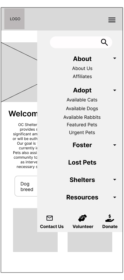
Simplifying the navigation from the original website was our goal. The original website had two separate navigations.
Sitemap
Styleguide
To create the style guide, a grid system was applied for the layout.
Simultaneously, we experimented with several color variations before settling on our final color palette. We decided on complementary colors to provide the right contrast for the overall design.
Additionally, I designed several variations of the logo to replace the original OC Shelter Pets logo for the re-designed website.
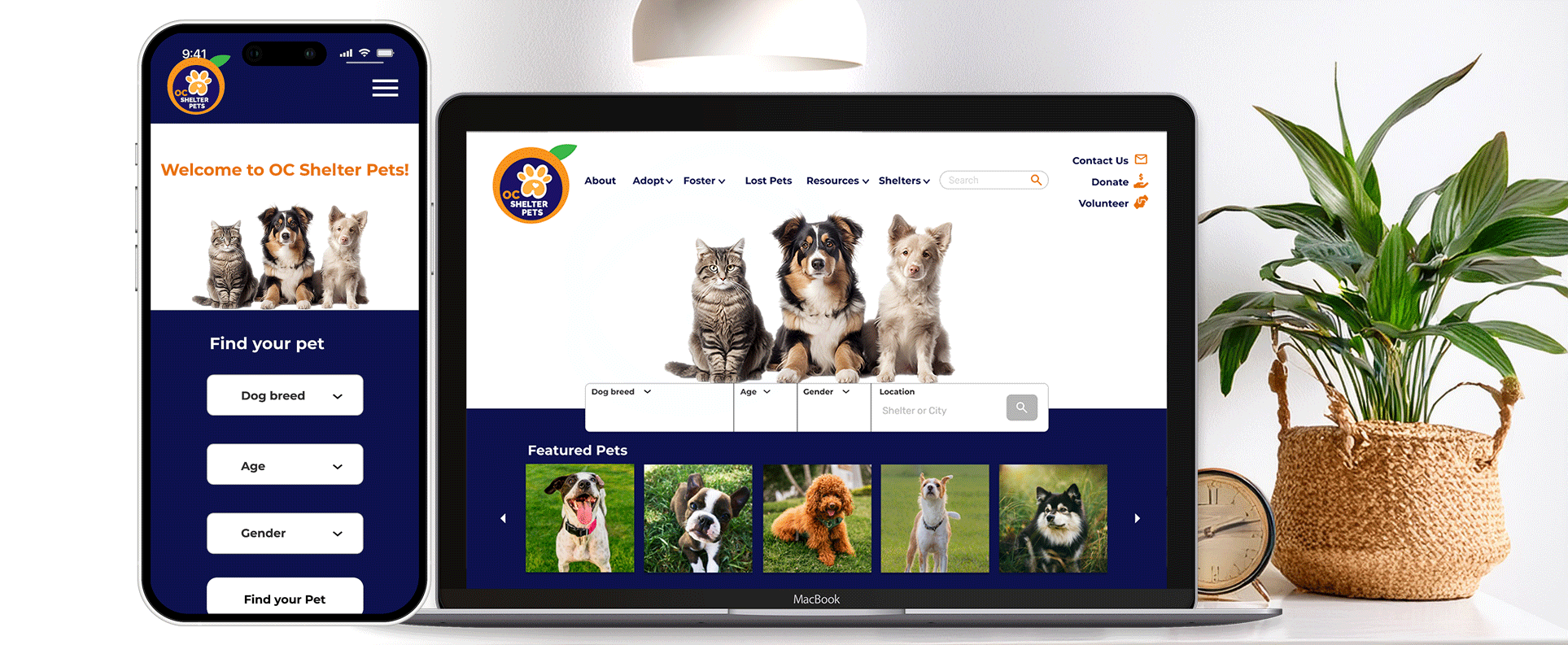
In order to design the wireframe, we started with the homepage. We wanted to make sure the navigation was working correctly and we researched on types of navigations that are responsive for both desktop and mobile. Our team came up with multiple variations of the navigation system. We decided to use the mega dropdown navigation for our desktop and overlays dropdown for the mobile design.
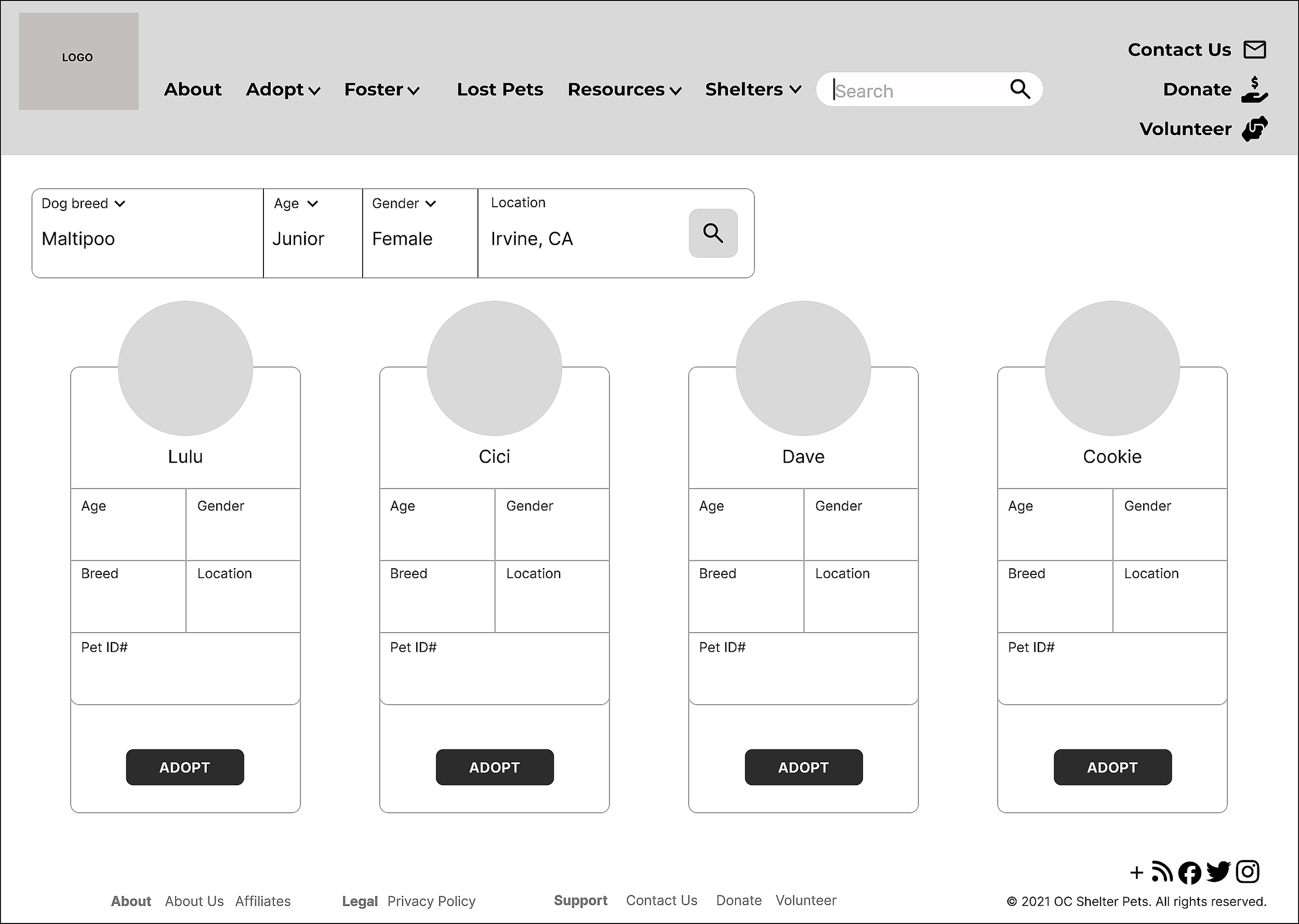
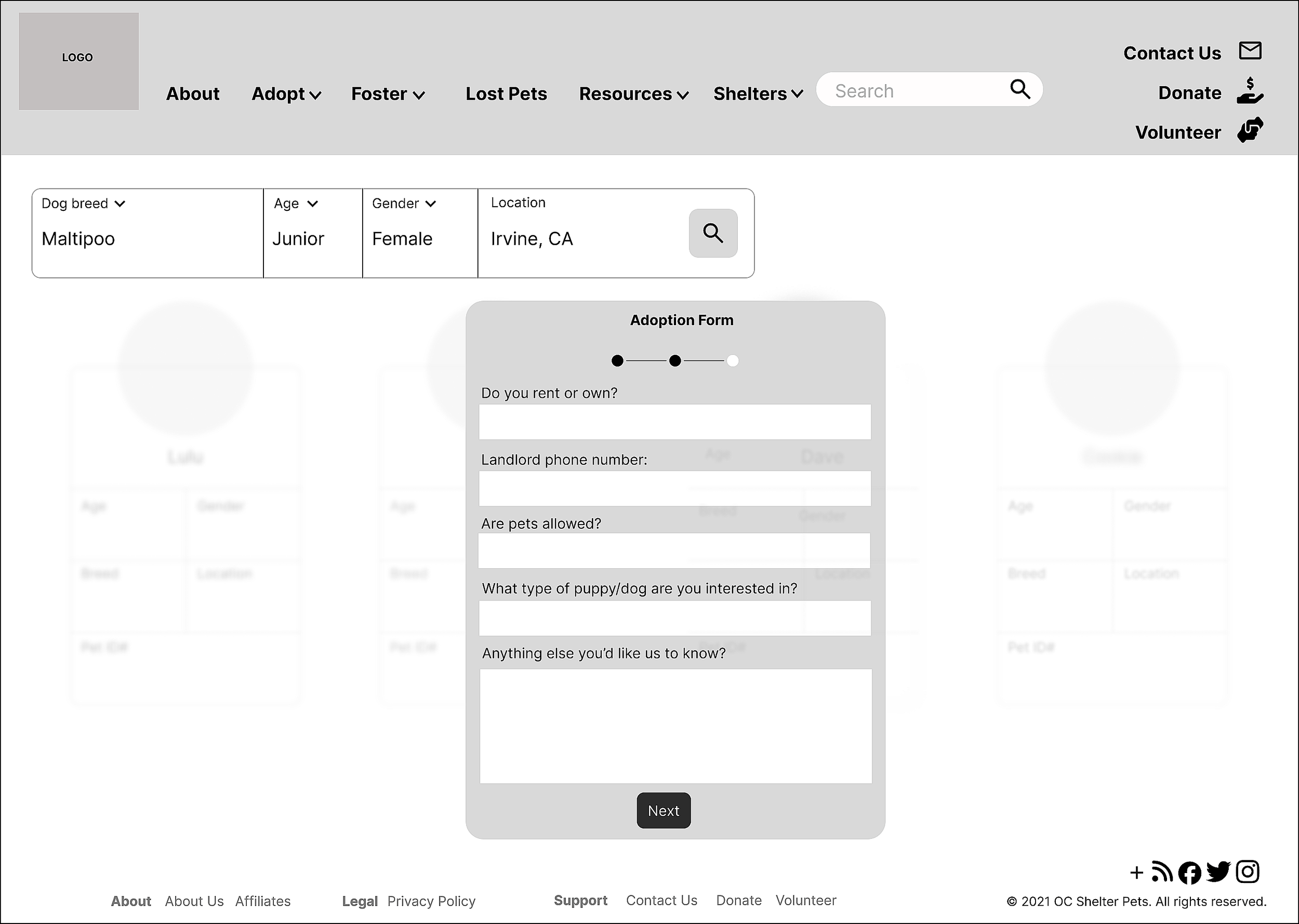
We focused on the adoption page, adoption forms, check out page and shelters page to begin for testing.
Wireframes


A/B Testing
We asked users to participate in a zoom conference call to evaluate each task and complete the adoption process during testing. Our task was to understand the user’s thoughts on the navigation process to reaching the end goal of adoption as stress-free as possible. The testers were provided two variations of the design and prototypes and the winning variant was the B variation.
Afterwards, we asked the testers to complete a survey testing questionnaire for the design test. Some of the questions asked include:
Was there any part of the design that you found confusing or unclear?
Which version made it easier to complete tasks (e.g., adopting a dog, using the search navigation, navigating pages)?
If you could improve one thing in the design, what would it be?
How intuitive is the desktop layout and navigation for users?
“The pet images and icons are clear and engaging, making the site visually appealing. Icons are easy to recognize”
“I like the color scheme a lot! Some of the image quality seems to vary but overall it looks super clean and well designed.”